If your website were a storefront, your sticky bar would be the sign hanging above the door. It’s the first thing people see, the message they can’t ignore, and if we are being honest, one of the easiest ways to make your brand look cheap or credible in a split second.
But here’s the problem: most sticky bars on the internet look like someone built them in a hurry and hoped no one would notice. Clashing colors. Blinding animations. Text that feels like it’s yelling at you. And then we wonder why people scroll faster than the bar can stick.
At Kiyfi, we see this constantly—brands spending real money on design, ads, and social media, only to put a loud, awkward sticky bar at the top of their site that instantly weakens trust. Sticky bars are small, but they can quietly sabotage your entire online presence if they are not done right.
Let’s talk about why ugly sticky bars hurt your brand and how to fix them—beautifully, simply, and effectively.
First Impressions Happen in Seconds — Don’t Waste Them
A sticky bar sits in one of the most powerful real estate areas on your website: the very top. It’s the first thing visitors notice, even before your logo registers.
So when your sticky bar is oversized, neon-colored, or looks like it belongs on a pop-up-ridden coupon site, the message is clear:
“This brand doesn’t care how it presents itself.”
People judge instantly. And if your sticky bar feels messy or pushy, they will assume your business is messy or pushy too. That’s the danger of digital body language—small signals create big conclusions.
Good design doesn’t just look better. It builds trust. And trust is the real currency online.
“Loud” Designs Doesn’t Convert Customers— Clear Designs Does
Many businesses assume that if their sticky bar is not getting clicks, it needs to be brighter, bigger, or more aggressive.
But here’s the truth nobody says out loud:
People don’t ignore your sticky bar because it’s “too subtle”. They ignore it because it’s poorly designed or poorly written.
Here’s what usually goes wrong:
- The bar color doesn’t match the brand
- The text is too long to read at a glance
- There is no visual hierarchy
- The CTA looks like an afterthought
- The whole bar feels like a discount sign at a dollar store
Conversion is not about volume. It’s about clarity. A clean, gently branded bar with a simple message like:
“Free shipping on orders over $50 → Shop Now”
will outperform a flashing, multi-colored chaos strip 100% of the time.
Your Sticky Bar Should Feel Like Part of Your Brand — Not a Sticker You Smacked On
A sticky bar is not a decoration. It’s not an accessory. It’s an extension of your brand.
If your website is calm, elegant, and minimal—but your sticky bar is bright red with five emojis—it breaks the experience. And when the experience breaks, so does trust.
Beautiful sticky bars do one thing exceptionally well:
They blend in so they can stand out.
They use:
- On-brand colors
- Clean, readable typography
- Thoughtfully spaced elements
- Polite messaging
- A CTA that feels like a natural choice
This is what makes a sticky bar feel intentional instead of intrusive.
Ugly Sticky Bars Make Your Website Look Cheap
Visitors often don’t know why a site feels “off”—they just feel it. And experience has shown us that low-quality UI elements send subtle signals that say:
- “This site is not professional.”
- “This business might cut corners.”
- “This doesn’t feel trustworthy.”
A single sloppy sticky bar can overshadow the beauty of the entire page.
But here’s the good news:
A beautiful sticky bar does the opposite. It elevates everything around it. When it’s well-designed and well-timed, users feel guided rather than pushed.
It’s the difference between a polite whisper and a megaphone.
Good Design Is Not About Being Fancy — It’s About Being Effortless
You don’t need gradient explosions, rotating badges, or animated fireworks to make people click.
What you need is something simple. Something human. Something that understands what the visitor came for and helps them get there faster.
At Kiyfi, we built our sticky bar creator with exactly this principle:
professional design without the design struggle.
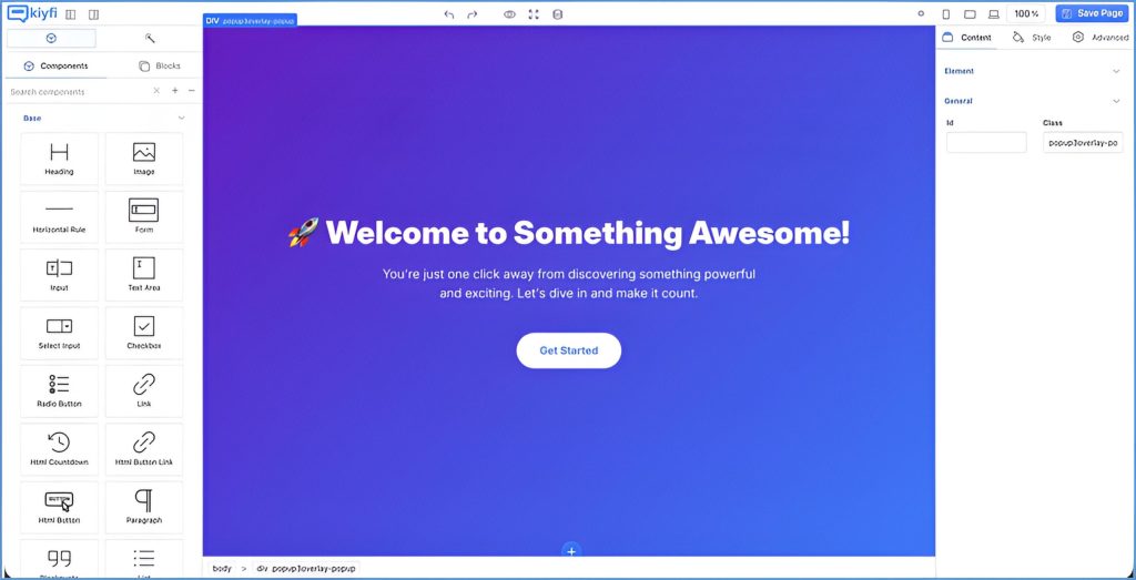
You choose clean templates, adjust them to your brand, write a message that matters, and you are done. It’s the easiest way to stop creating clutter and start creating clarity.
The Sticky Bar Should Help — Not Distract
A sticky bar is a tool. It should serve a purpose:
Announce an offer ✔
Capture an email ✔
Share an update ✔
Deliver value instantly ✔
But it should never:
Block content ✘
Steal attention ✘
Slow down the page ✘
Annoy the visitor ✘
If your bar is getting dismissed, scrolled past, or ignored, the issue is not the concept—it’s the execution.
Make Your Sticky Bar an Asset, Not an Eyesore
Your website deserves better than a clunky strip of text that feels like a last-minute idea. A sticky bar should be an elegant part of your browsing experience—quietly helpful, visually aligned, and strategically smart.
So stop making ugly sticky bars. Stop blending into the noise. Stop losing conversions because of design shortcuts.
With Kiyfi, you can create sticky bars (and popups) that look like they were handcrafted by designers—without needing a designer at all.
Because in a world full of visual noise, beauty is not optional. It’s a competitive advantage.
Create your first beautiful, on-brand sticky bar with Kiyfi in minutes—try it today!