Digital users today scroll faster than ever. They skim, swipe, bounce, and switch tabs before your message even warms up on their screen. In this fast-moving environment, brands often assume they need something big and bold to grab attention—large popups, full-screen takeovers, dynamic animations. But what if the smallest element on your page could quietly outperform them all?
The humble sticky banner—that small strip at the top or bottom of a webpage—has become one of the most undervalued pieces of UI.
At Kiyfi, where we help businesses create high-performing sticky bars and popups, we have seen this tiny element do some surprisingly heavy lifting. Yet most people still treat sticky bars as website decoration instead of a strategic conversion tool.
It’s time to rethink the sticky UI.
Why Tiny Works in a Big, Distracted Internet
The secret power of sticky banners lies in their size. They are minimal, and in today’s crowded interfaces, minimal equals effective. Here’s why:
1. They blend in—just enough
Users have developed banner blindness, but not to sticky bars. Why? Because sticky bars don’t pretend to be ads. They sit in a safe zone—visible but not intrusive. A user does not feel pressured; they simply notice.
2. They deliver context at the perfect moment
Instead of disrupting the content, a sticky bar enhances it by sitting alongside the user’s natural reading flow. It feels like your website is speaking softly rather than shouting.
3. They stay with the user
A regular message disappears when the user scrolls. A sticky bar politely follows, reminding, guiding, and nudging without breaking rhythm. It stays available—like a digital bookmark.
This combination of visibility and subtlety is rare in UI elements, and it’s what makes sticky bars surprisingly powerful.
Sticky Bars Are Not Just Announcements. They Are Smart Decision Nudges.
Most websites use sticky bars for simple messages: a sale, a cookie notice, a shipping update. That’s fine, but sticky UI can do much more.
When used strategically, a sticky bar becomes a micro-conversion engine.
Highlight urgency—calmly
Instead of a dramatic countdown popup, a small sticky banner with a quiet “Sale ends today” often performs better. It whispers truth instead of yelling urgency.
Guide user flow
A sticky CTA, like “Start Free Trial” or “Book a Call,” is always within reach. No need to scroll back up.
Provide reassurance
A small line that says “Free returns on all orders” can reduce purchase hesitation more effectively than paragraphs on a product page.
Segment without friction
A sticky bar can gently ask a question:
“Are you a student? Unlock discounts.”
No interruption. No pressure. Just a choice.
This is the future of UI—micro nudges instead of macro disruptions.
The Psychology Behind Sticky UI: Why People Respond
A sticky banner looks simple, but the psychology behind it is not.
1. Low cognitive load
Big popups demand decisions: close, accept, decline, dismiss, later, not now. A sticky bar demands… nothing. Users process the message passively before acting intentionally.
2. Safe attention
People are more receptive to interactions they control. Sticky bars offer user-led engagement, which builds trust.
3. Repetition without annoyance
Humans respond to repeated cues, but only if repetition feels natural. A sticky banner’s continuous presence acts like gentle reinforcement.
4. Perceived value
Because sticky bars are subtle, users assume the message is genuinely useful—otherwise, why wouldn’t you display it more aggressively?
This psychology transforms a tiny banner into a giant persuasion tool.
How Brands Are Getting Creative with Sticky UI
Sticky bars are evolving into flexible micro-interfaces. Here’s how smart brands are using them:
- Sticky survey bars that collect quick insights with one tap
- Localized sticky announcements based on visitor country or behavior
- Floating discount unlockers that activate on scroll depth
- Long-scroll progress bars combined with CTAs to boost engagement
- Sticky onboarding guides that help users navigate complex dashboards
The sticky bar is no longer just a banner. It’s becoming a mini-assistant.
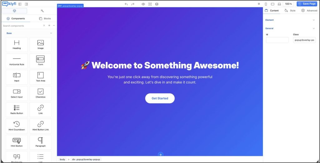
How Kiyfi Helps You Turn Sticky Bars Into High-Performing Assets
At Kiyfi, we have built tools that help you move beyond bland banners and into strategic UX.
Our sticky bars allow you to:
- Add dynamic personalization (location, device, behavior, time)
- Run A/B tests to find high-performing messages
- Use smart triggers like scroll depth, exit intent, or repeat visits
- Customize your sticky bar so it fits your site like a natural extension
- Combine sticky bars and popups for layered conversion paths
- Track conversions with clean analytics
We believe the smallest UI elements should have the biggest impact, and Kiyfi is built around that belief.
The Future: Sticky UI as a Quiet Conversion Strategy
Websites are moving away from loud marketing tactics. Users want smoother, calmer, more respectful experiences. Sticky UI fits perfectly into this shift.
The future is not about shouting louder. It’s about whispering smarter. And sometimes, all you need is a tiny banner doing a very big job.
Turn tiny UI into big results—create your smart sticky bar with Kiyfi.