There is an odd, almost paradoxical truth in the world of online marketing: customers want to feel in control, yet they also want helpful guidance. They don’t want to be interrupted, but they do want to discover things that matter to them. Popups, when used carelessly, break this delicate balance. But when used with intention, timing, and empathy, they become a form of gentle marketing—a quiet nudge rather than a loud demand.
This is exactly where smart websites stand apart. They don’t treat popups as billboards. They treat them as conversations. And that mindset makes all the difference.
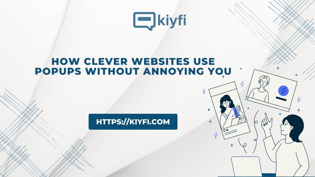
Welcome to the gentle art of getting noticed.
The Popup Problem (and the Opportunity Behind It)
Let’s start with the obvious: many users say they hate popups. But the data says something more interesting—people actually interact with them a lot. Email popups consistently outperform almost every other type of website conversion tool.
Why the contradiction? Because people don’t hate popups—they hate bad popups.
A bad popup is a shout. A good popup is a whisper.
With tools like Kiyfi, websites can shape that whisper into something meaningful—an offer that arrives at the exact moment a visitor is open to receiving it.
Smart websites don’t display popups. They schedule them
The first rule of gentle marketing is timing.
A popup that appears the second someone lands on a page is like a waiter handing you the bill as soon as you sit down. It’s not rude—just out of place.
- What is the visitor trying to do right now?
- How can we help at the right moment without interrupting?
Here’s what they do differently:
- They trigger a discount popup after a visitor shows interest—scrolling 50% down a page, viewing multiple products, or spending 60+ seconds exploring.
- They use exit-intent popups as a soft safety net, not a last-ditch pitch.
- They delay newsletter invitations until after the user has consumed some value.
The popup becomes a response to behavior—not a demand for attention
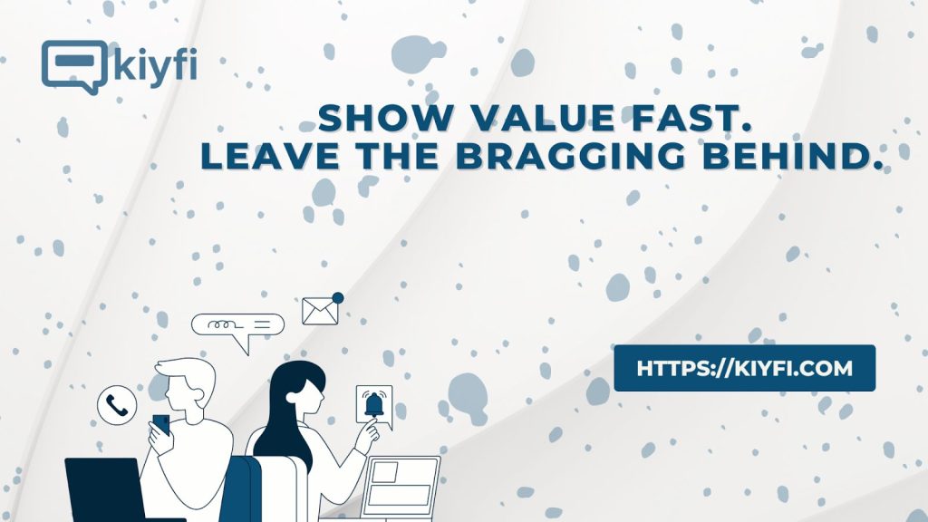
Smart Sites Don’t Brag. They Communicate Value Quickly.
Nobody wants to read a tiny essay inside a popup. Smart websites understand that clarity converts better than cleverness.
Instead of saying:
“Subscribe to receive the latest updates, stories, insights, and special offers…”
They say:
“Get 10% off your first order.”
Or:
“One email every week. Only helpful stuff.”
Or:
“Save this product for later.”
Simple messages feel honest. They respect the user’s time. They reduce friction.
With Kiyfi’s clean, minimal popup templates, this type of clarity becomes easy—even for site owners who don’t speak “design.” You choose a layout, adjust a few words, and everything falls into place.
Smart Sites Make Popups Blend, Not Clash
Think of a popup like a guest arriving at a party. If they dress like they are from a different century, people stare. If they blend with the atmosphere, they feel like part of the experience.
Smart websites take the time to make their popups match the site’s:
- Colors
- Tone
- Typography
- Energy
Even subtle details—like rounded corners or soft gradients—can make a popup feel like it belongs.
Kiyfi’s design features support this beautifully by allowing creators to match their popups with their brand identity without diving into code or design software.
Smart Sites Offer a Choice (Not a Trap)
Ever seen a popup where the “No” button says something guilt-inducing like:
“No thanks, I don’t like saving money.”
Not only is it outdated,but it’s condescending. Smart websites respect their visitors. Their popups reflect that respect.
They use:
- Clear close buttons
- Gentle copy
- A tone that feels human
Something like:
“Not now, thanks.”
Or:
“Maybe later.”
This small detail builds trust—and trust is the true currency of the internet.
Smart Sites Use Popups to Build Relationships, Not Just Conversions
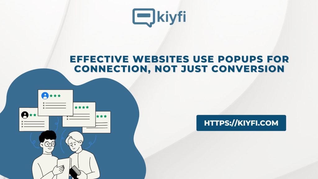
Popups are not just for discounts and email captures. Smart websites use them for:
- Micro-surveys: “Was this page helpful?”
- Guidance: “Can we help you find the right product?”
- Announcements: “New feature just launched.”
- Personalization: “Tell us what you are shopping for.”
These are not interruptions—they are enhancements.
With tools like Kiyfi’s sticky bars and subtle slide-ins, websites can communicate without ever blocking the user’s view or breaking their flow. It’s the digital equivalent of tapping someone on the shoulder instead of stepping in front of them.
Smart Sites Keep It Light. They Keep It Honest.
The most graceful popups share one trait: sincerity.
They don’t pretend. They don’t feel pressure. They don’t overwhelm. They simply say:
“We think you might find this useful.”
And if the user disagrees? That’s fine, too.
When a popup feels like a suggestion—not a demand—it becomes more effective and more appreciated.
This gentle approach earns better results over time because visitors don’t feel tricked—they feel understood.
The Gentle Art Starts Here
The modern web is loud. Every brand is trying to be everywhere, all the time. But the smartest websites know something others forget: attention is earned, not captured.
Popups and sticky bars are not tools for grabbing attention—they are tools for guiding attention. Used thoughtfully, they create harmony between what the visitor wants and what the website offers.
That’s the gentle art of getting noticed. And with Kiyfi, mastering that art is easier than ever.
Want popups that feel like helpful nudges, not interruptions?